GLua UI Guide
I'm not an expert, some tips may be incorrect or wrong, also, this is for developers having issues with UI, and some information may not be valid for experienced users. If anything is wrong, feel free to point it out.
This guide will help you if you want to :
- Improve your design
- Improve your gui code
The end goal is to make a good-looking, easy-to-read UI. This is not a professional guide for UI, but enough for Gmod.
0. SUMMARY
- Vocabulary
- Color
- Rules
- Good Practices
- Docks
- Custom fonts
- Matrix Animations
- Math.Ease
- ColorToHsv
- RenderTarget
- Stencil
- MoveTo/AlphaTo/SizeTo
- Cache Everything
- DTextEntry
- Gmod Derma Skin
- Gradients
- EditablePanel
- IsHovered
- SetContentAlignment
- draw.SimpleText
- FProfiler
- Rounded Box
- Useful, must-know functions
- References
- Design
- Gmod Libs
- Colors
- Icons
- Spice up your UI
- Bonus 1 - Figma Plugins
- Bonus 2 - Example
1. Vocabulary
- UX: the overall experience of a person using a product such as a website or a computer application, especially in terms of how easy or pleasing it is to use
- UI: the means by which the user and a computer system interact, in particular the use of input devices and software.
- R,G,B: Red, green, blue. Values that compose a color.
- Font weight : Thickness of your font. This is a low-weight text. This is a big-weight text
2. Color
Tough topic to resume. Don’t hesitate to look for complete guides. This will be focused on gmod UI meta: Monochromatic dark-based theme.
- Start with a color ( I recommend picking one from flatuicolors ). I'll use a green color: #2ecc71
- Create a color palette ( Pick one method ):
- https://uxplanet.org/how-to-apply-monochromatic-color-scheme-in-design-10c809d671a5
- Monochromatic option on https://color.adobe.com/create/color-wheel. Replace the text in the middle color with your new color. Advice: Your background colors ( dark colors ) should have r, g, b values close to each other. There shouldn’t be a gap of more than 20 between each of them. If this happens, switch to custom type, and lower high values.
- The result, for the green color above, on color.adobe:
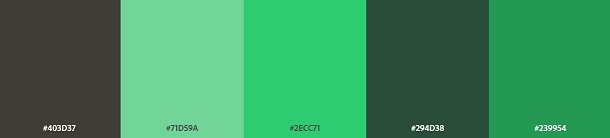
- You may need to modify colors, especially background ones. Use this palette as a base.
3. Rules
- Use a good-looking font. Ex: Poppins, Roboto, Raleway, Pacifico, Quicksand, Oswald, Lato, Inter, Open Sans.
- Don’t be scared to make a small UX. You don’t need to make big titles, big cases, big text. Have a look at how other people resolved the issue. Try to make your design small.
- Consistency. Same value for rounded box, same font, same margin if you can, same icon type ( Filled, solid, duotone, … ). This is not completely true for the color palette, since you may need to change color on slight details. However, if you change, it should be a slight percentage of the overall UI. ( Exemple 1, Exemple 2 )
- Variations of font-weight. Use bold text ( >600 weight ) for important information ( title, keywords ). Every good UI will use a different font weight.
- Make the title important. You can make them bigger, or use a different color brightness, or a different weight.
- Don’t use completely dark colors. Use at least some saturation. Simpler said: Don’t use 0,0,0 RGB, at least 16,16,16. Also, I would recommend using some color tint on it. ( Extra reading: https://ianstormtaylor.com/design-tip-never-use-black/ )
- PROTOTYPE YOUR UI. If you need to remember one thing, remember this one. Your UI will be way better if you prototype it on software rather than making it on the fly. Like Figma or Adobe XD. I recommend Figma but this is personal taste. Don’t be scared, these software are easy to take in hand.
- Don’t add colors instantly. Focus on making a good UX before.
- 60/30/10 Rule. A simple trick to make good UI. 60% of color should be your background color ( The closer color you have to white if you are making a white design, closer to black if you are making a black design ). 30% should be secondary color ( A darker color than your picked color ), 10% should be your accent color ( The color you based your palette on). ( Example: https://uxmisfit.com/wp-content/uploads/2019/05/color_60_30_10_sample.jpg ).
4. Good Practices
Docks
Use docks for UI rather than SetPos/SetSize. Better for responsive, easier to use, cleaner code, margin and padding available.
Custom Fonts
If you use materials in gmod, they won’t be smoothed (You can easily see pixels). Even with using smooth parameters. There 2 ways to avoid this:
- Use a web UI. Hard to do since it implies using awesomium, making a lot of basic html/css things missing.
- Use a custom font.
Comparison picture ( First is material, second is material with smooth, third is with font ). You can see that the font is keeping details better than the png-based icons. ( https://imgur.com/a/kQdlkgq )
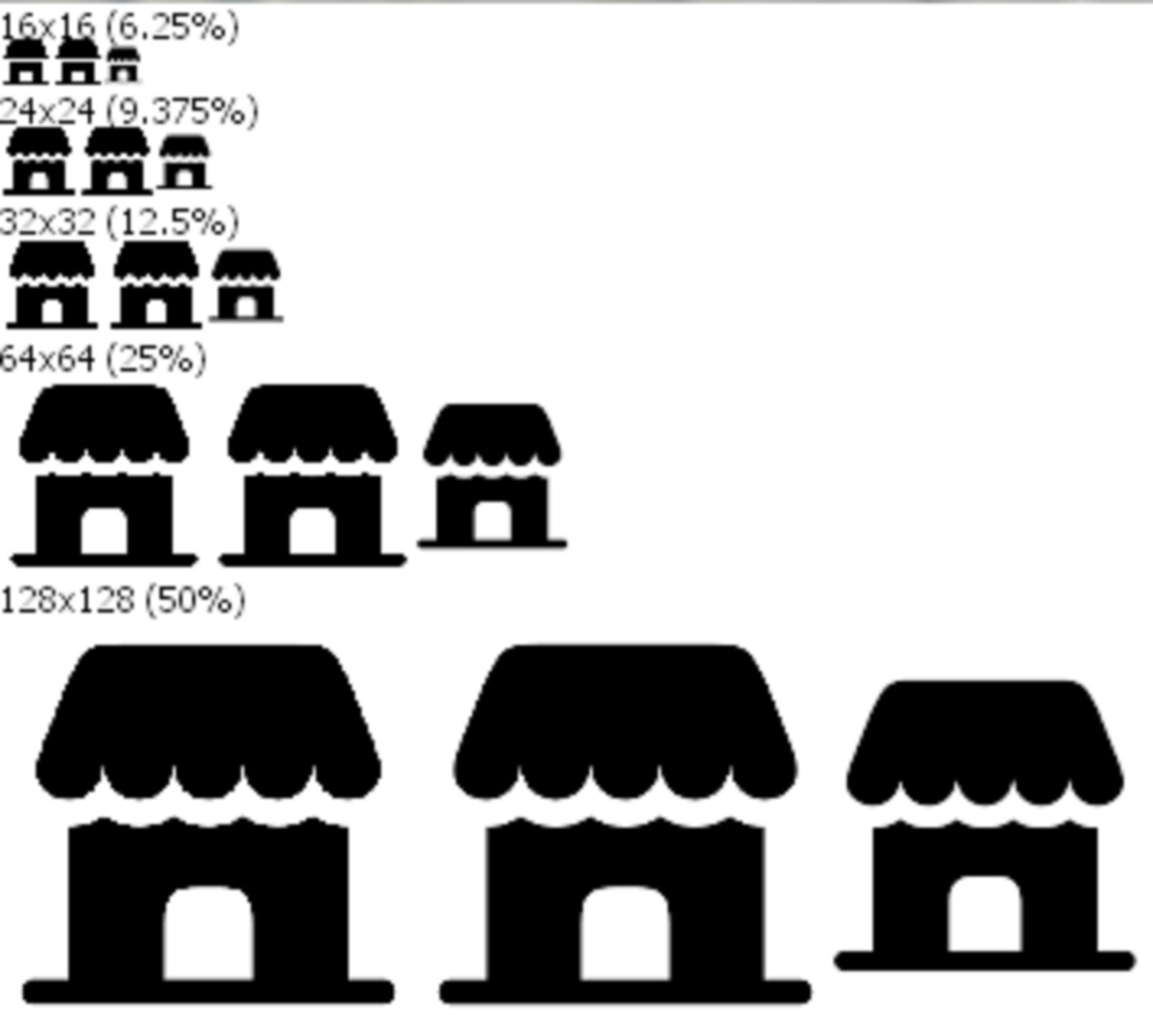
To make your own custom font, you can use:
- (Website, the best option) https://glyphter.com/
- (Software) https://github.com/Nebukam/mkfont
Pros:
- Lightweight contents.
- Usable with text-based panels.
Cons:
- Can’t use highly complex svg
- Drawing with stencil enabled makes it pixelated again.
Matrix animations ( cam.(Push/Pop)ModelMatrix )
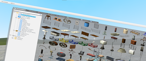
Niche tool, used to make stunning animations. You can make your own SetSize on the whole panel, rather than resizing only the parent. Useful to use on “complex” panels. You can make your own SetPos ( Translate ). You can also rotate things, even rotating text in 3D.
Example to break your favorite menu:
Result ( I didn’t resize the picture, this is an unedited in-game screenshot ) :
Math.ease, math.sin/cos
A bunch of pre-made math functions to make smooth transitions. If you want, you can also use math.cos or math.sin, this is an efficient way for looped animation if you use CurTime as an argument.
ColorToHSV
If you made a rainbow thing before, you may use HSV. ColorToHSV will put your color to HSV. Making it easy to get a darker/lighter color, getting a color with a different hue. Use HSVToColor to get your color back.
Code example:
Result:

RenderTarget
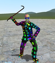
Second most powerful tool. Used to create a new graphic environment, outside of the main gmod graphic environment. This graphic environment is then usable as a material. For example, you can create a new environment, render a player model in it, then render it in your UI. This is the main tool for a lot of addons, like painting add-ons, car painting, making optimized RenderView, and texture/materials modification.
Code example, to edit kleiner materials:
Result:
Stencil
Most powerful UI tool. Used to make rounded AvatarImage, borders on every panel, circle DModelPanel, and A LOT of things. Every addon with proper UI WILL use stencil at some point.
My explanation of stencil: Think of your screen like a bunch of pixels, 1920 pixels every row, for 1080 rows, so 1920x1080 in my case. Each pixel has a “score”, initialized at 0. You can change this number only by drawing or resetting everything at 0 ( ClearStencil function ). The stencil lib has 2 types of functions:
- Comparaison function: Checking for each pixel, if you can draw on it, based on his score AND current condition. If the current condition is not met, gmod won’t draw on this pixel. This is the power of stencil, you can filter which pixels you draw, based on conditions and their score. Ex: Only on the pixel with a score higher than 1, or lower than 1, equal to 1, or draw everything, refuse no matter the score, for example. To check if the pixel score is 1, render.SetStencilReferenceValue(1) and render.SetStencilCompareFunction(STENCIL_EQUAL)
- After-Draw functions: For each pixel, after you tried to draw:
- Condition was not fulfilled? ( FailOperation ).
- Draw happened ? ( PassOperation ).
- Condition was fulfilled, but the draw on this pixel would be hidden ( Ex. Draw 3d model behind a wall, we wouldn’t see this 3d model ) ( ZFail Operation ).
- For all these cases, you can set something to do. Ex. Reset the pixel score to 0, increment it, and don’t touch the score.
Have a look at the excellent repo of Lexicality for examples ( Or gmod wiki, same thing but with pictures ).
MoveTo/AlphaTo/SizeTo
Smooth SetPos/Alpha transition.
Cache Everything
Cache everything. Cache colors, vectors, angles, and tables used in DrawPoly. This includes circles, arches, and everything. If you are in a case you need to modify a r,g,b value frequently. You can edit r, g, b values by doing COLOR.r = YOUR_VALUE. Avoiding recreating a new color.
DTextEntry
- DON’T override DTextEntry paint without using the default paint function. This would break default behavior, like selecting text, the cursor painting. The good, clean way is to use the default paint function and modify it
- Don't use the think function on DTextEntry to verify the input. This is an unoptimized, unreliable way. Use DTextEntry:OnChange
Gmod Derma Skin
If you plan to make your own addon suite, making your own vgui panels (copy panels code in lua/vgui/ and make your own) or your derma skin is a good idea
Gradients
You can use gradients with gmod without making a custom texture. Material(‘vgui/gradient-d’). d for down, replace the d with:
- u for up
- l for left
- r for right
EditablePanel
You can use EditablePanel rather than DFrame. If you want an “empty” DFrame without losing attributes.
IsHovered
Use OnCursor(Entered/Exited) rather than IsHovered. This is easier to use, in case you need to track the hovering state or start an animation.
SetContentAlignment
A useful function for text-based panels, you can override where the text is drawn, make it draw on another side ( Top-Right for example )
draw.SimpleText
- Prefer DLabel or surface draw over SimpleText with static string. The reason behind that is recalculations every call of the text size. In the long run, if you use a lot SimpleText, this can take some performances.
- Returned values from draw.SimpleText is the result of surface.GetTextSize for your input text. This could be useful if you draw a lot of text and you need to know the text size. ( But as said before, cache text size and use surface call if you can, rather than using this tip )
FProfiler
This is a bit out-of-context, this is focused on anything using draw hooks ( HUD, etc … ). You can apply this on UI but this is harder and less useful.
FProfiler is a benchmark tool, so you can test the optimization of your code and improve your code. I recommend you give FProfiler a go before submitting an add-on, to be sure about the optimization.
RoundedBox
Use corner values that are a power of 2 if you can. Also, you can’t use roundedbox everywhere. Ex: if you use a stencil. To get around this issue, you can make your own RoundedBox with DrawPoly. Warning: This is less optimized to use DrawPoly than RoundedBox.
Useful, must-know functions
- SetDrawLanguageID/SetDrawLanguageIDAtLeft: Remove the 2-code language drawn on the right if the argument is false. This is important since some languages ( I’ll assume others than English) have this thing drawn on every DTextEntry.

- SetTextInset: Margin on text inside panels, without modifying behavior.
- Draw.GetFontHeight: Cleaner than GetTextSize + random text, if you want the height of a 1-line text height.
- NoClipping/DisableClipping: Allow to draw outside of your panel boundaries. Useful to draw solid borders/background around your panel without using weird margins.
- GetContentSize: Get the size of panels, or text-based panels. Retrieve the size of DLabels/DTextEntry without GetTextSize, etc...
- SetPaintedManually: Override gmod default render of your panel. Paint the panel when you want, can be used to render vgui everywhere (3D, 3D2D, on hud, even on players themself, etc...)
- SetPaintBackgroundEnabled: Disable background drawing on any panel. Cleaner code, and this is better than making empty paint functions.
5. References
Design/Inspiration:
- Dribbble. I use it nearly every time I start a new UI.
- Awwwards
- Designspiration
- Spice Up Designs
- Behance
- GameUIDatabase
Gmod UI libs ( WARNING: Check for usage conditions and license! )
- Xenin Framework, by sleeppyy
- 3D2D lib, by TomDotBat
- Pixel-UI, also by TomDotBat
- TDLib, by Threebow
Colors
- FlatUiColors
- List of gradients
- Get a design with the same color. Filter by your main color.
- Color palettes. (Harder to use if you are a beginner since these palettes are not monochromatic)
- Mesh Gradients. Modern gradient.
- Pastel colors. Pastel colors list.
- Contrast Checker. Check if your colors have a good contrast, for readability.
Icons
6. Spice up your UI
If you feel comfortable with the aspects above, you can improve your UI further with trends/tips:
- Patterns. For example, Addon using this: https://media.gmodstore.com/_/script_media/d2979ed2700d62a537916738eab1134b.png
- Simple Gradients, Organic gradients, Abstract gradients, guide
- Acrylic UI, used by Microsoft. A Glassmorphism derivation.
- Glassmorphism UI is a well-known UI trend in current days.
- Aurora backgrounds. Hard to use for gmod in my opinion.
- Minimalism. Easiest UI if you are starting, for Gmod
- 3D design. Could be made with Matrix animations ( See below )
- Material UI. Simple to make in Gmod.
- Brutalism. May be too hard to use on Gmod, but look unique.
- Pastel colors. You can make your UI design more unique, a lot of Gmod UIs don’t use pastel colors. If you use it properly, you can make an outstanding UI. Transform your color to HSV. Lower the saturation ( second parameter ) and upper the value ( third parameter ).
- 37 Easy Ways to Spice Up Your UI Designs, 7 practicals Tips, 5 Advanced UI Design Hacks for Beginners
- 4 rules for intuitive UX.
- 100 Things a UX/UI Designer should know.
- 7 rules for creating gorgeous UI
- Typewolf is a good site for fonts
- Monochromatic colors
Bonus 1. Figma plugins
- Unsplash and Unsplash Avatars. For pictures.
- Pattern Hero. For patterns
- Iconify. Get icons quickly. Variant: Content Real
- Isometric
Bonus 2. Example
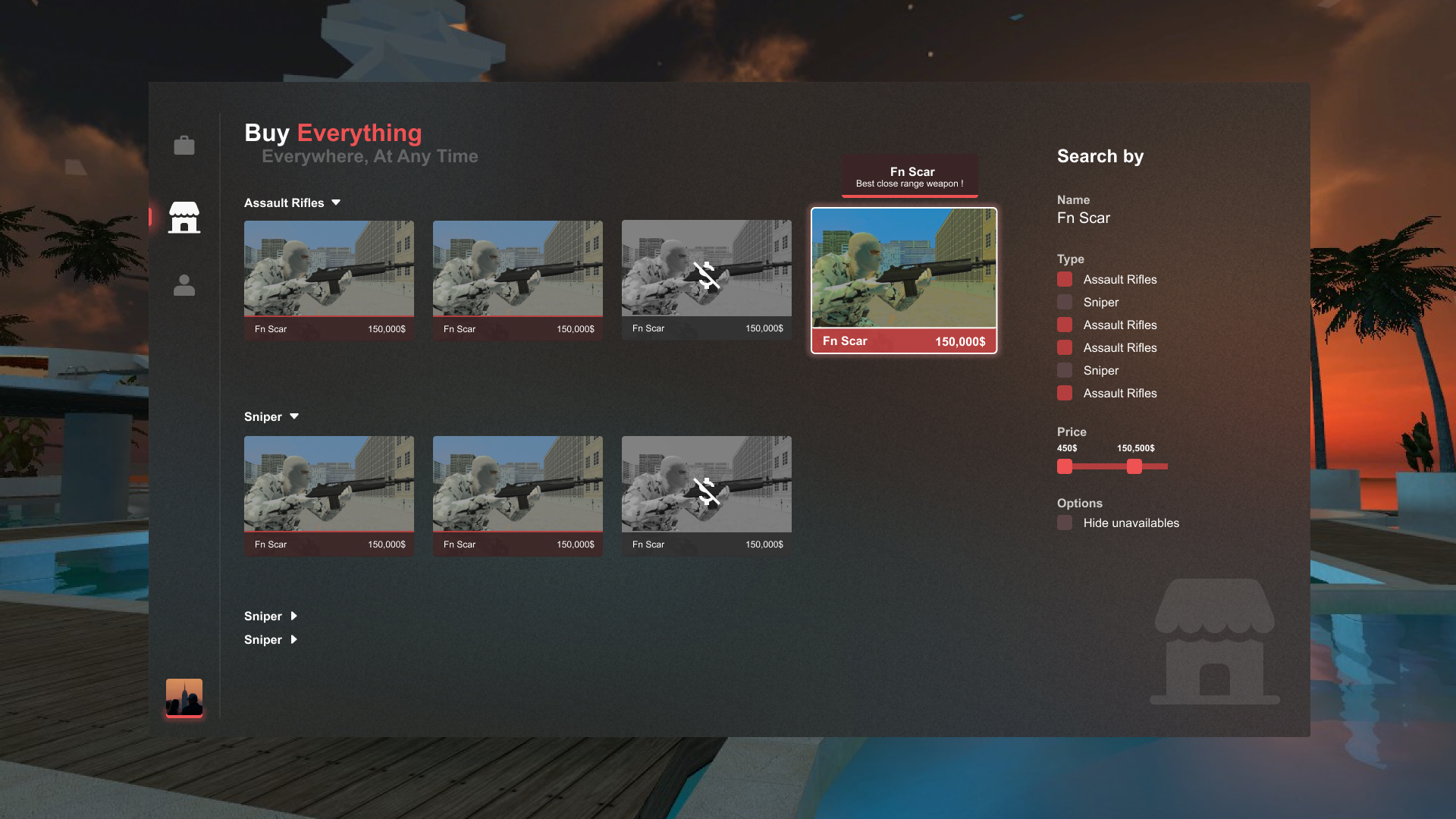
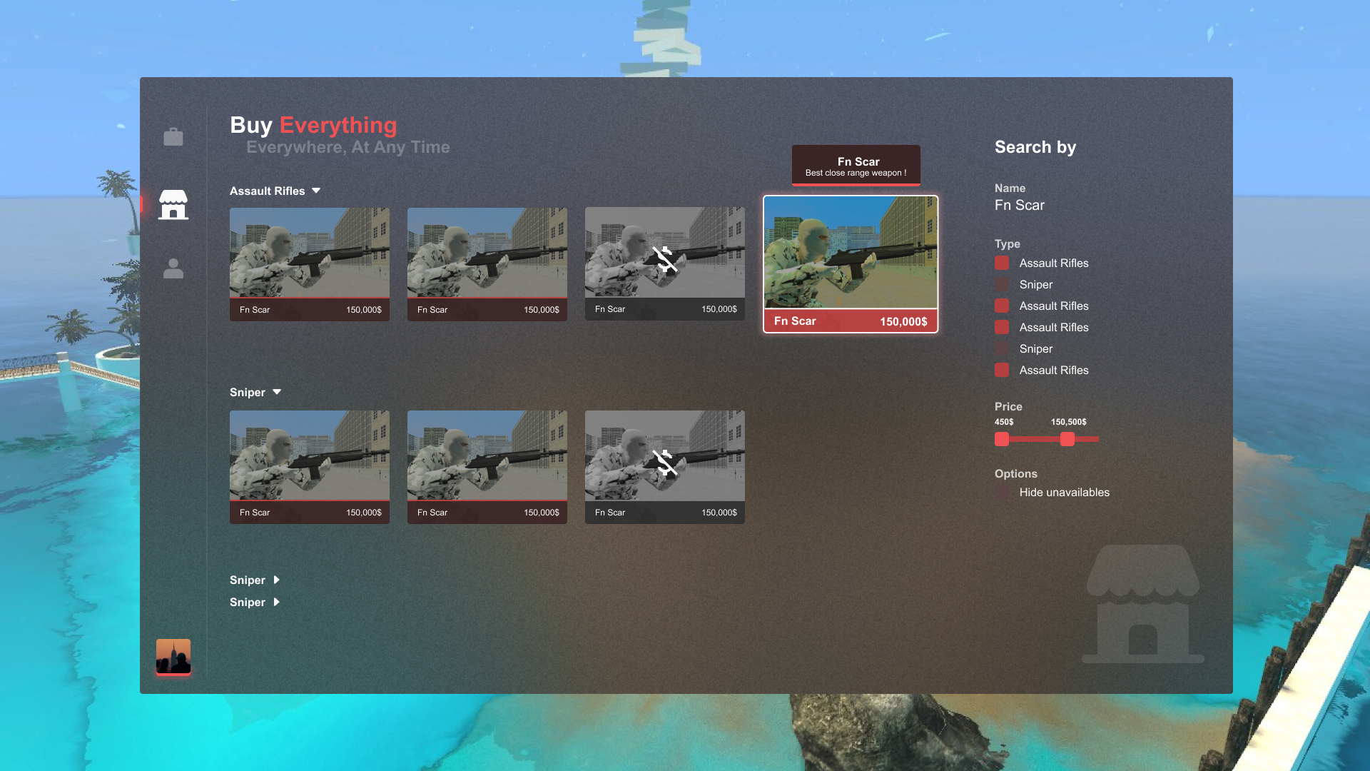
This is an example, of trying to make a red, F4 menu, in the weapon shop tab from scratch. I’ll try to follow the acrylic UI trend.
- First step: Picking a color
- I will use “Amour” from the Canadian palette on flatuicolors.
- Second step: Trying to search for inspiration
- Navbar on Dribble:
- https://dribbble.com/shots/16848996-Sidebar-Navigation
- https://dribbble.com/shots/17143561-Sidebar-Navigation-Menu-Animation
- Buy on Dribbble:
- https://dribbble.com/shots/21179922-Real-Estate
- Third step: Thinking
- We need a filter, a navbar, and a list of items.
- What do we need to draw for weapon items? Their name and price. Players won’t care about the description, maybe when they hover it, but this is not important information. We need to have a card with the item picture, the price, and the name. From the buy dribbble link, we can take the same layout. A cool thing would be to draw a player with the weapon in hand, rather than the weapon alone.
- Same for the navbar, the glow on the selected tab is a good idea, a list of icons for the navbar would be great. Also, the avatar at the bottom is good.
- Concerning the filter, what filters are relevant? Price, name, weapon type. We have no more, these represent all info drawn for each weapon. We can put it everywhere.
- Since this is an acrylic design type. We need to find a way to reproduce it ( I found a figma template with everything inside ).
- Now, we have every idea we could use.
- Fourth step: Cooking
- The plan was a horizontal layout, a navbar on the left, and the main info ( Shop tab ) in the center. Filter on right.
- Make the card bigger on hover.
- For the rules:
- Round value: 4
- Font size: 20, 12, 18, 24.
- SVG: Filled
- Use glow.
- Try to follow the 60/30/10 rule.
- Result:
- Figma link: https://www.figma.com/file/ACx6OAhULANShLtJDVoJho/Untitled?type=design&node-id=1%3A4&mode=design&t=a0LjEldlN324uIRh-1