
Pats theme(s?)
So the last 3 days I've been trying to learn HTML & CSS. HTML didnt take more than a couple of hours ofc but building sites that I wouldn't use for anything got boring really fast. I was previously using the dark theme created by Lunaversity & Billy, but I really disliked its borders and various other stuff and it felt kinda unfinished as parts of it wasnt there.
This release doesn't have:
- When you hover over notifications in "view all notifications" it's white not black.
- Rounded images on everything but banner & media. I tried but I could only do it !important and that obviously rekt the banner & media section too.
- White background in markdown preview.
- Other stuff I havent found yet.
Issues:
- How the hell do you remove the fucking glare from those buttons?
- The bottom padding in community section is totally off.
Thanks to:
- Lunaversity for creating the CSS I use from his dark theme in here (approx 200 lines, a bit of it edited)
- Billy for creating the Chrome extension used in Lunas themes, that I used to make it into a Chrome addon.
- Metamist for telling me to stop abusing !important and teaching me various stuff when I asked
And yes, I asked Luna before I posted this.
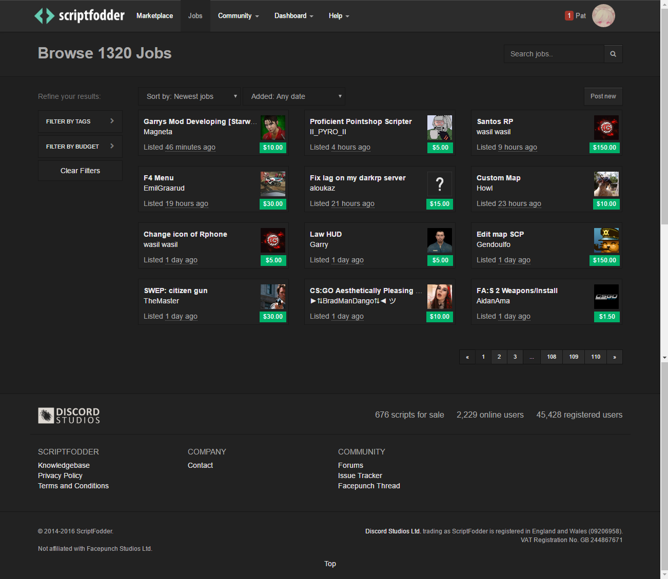
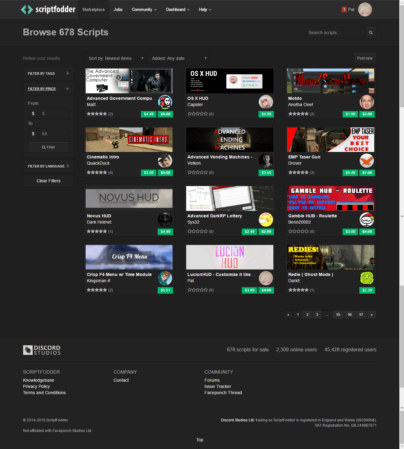
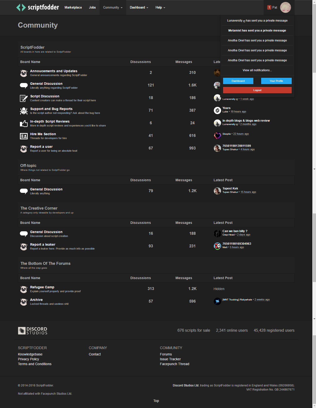
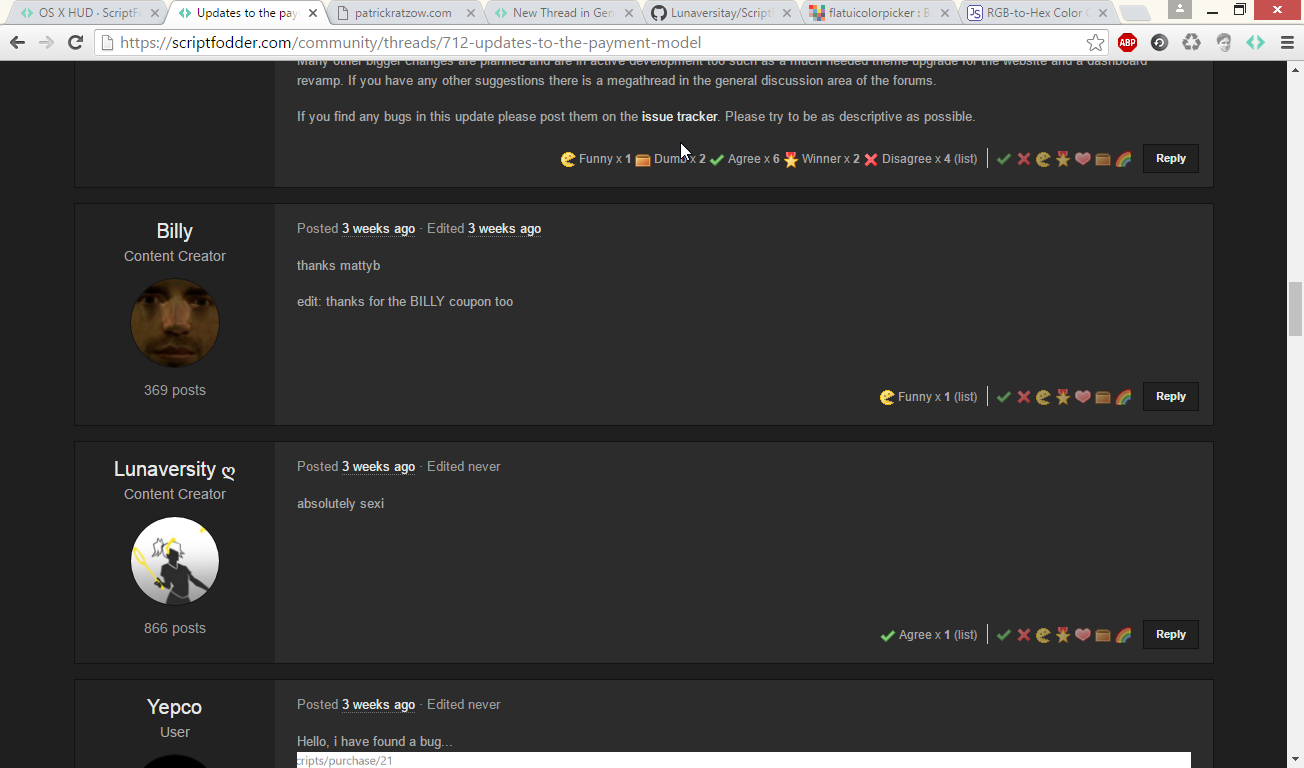
How to install: You go into settings -> extensions and check Developer Mode. After that you press "load unpacked extension" and you select "scriptfodder_themes-master" where you saved the file you downloaded from GitHub. After that (assuming you got it working) you just go onto http://scriptfodder.com and now you can select themes by pressing on the ScriptFodder icon in your extension toolbar.
If you already have Lunas themes installed, idk what will happen but I don't think its gonna be pretty
Please remember I've barely done CSS for 3 days, I just thought this was a fun little project as a learning progress, so consider that when you puke over my code.
###Download