
Suggestions for Jobs & Freelance
Last read Never
I have a few suggestions for the Jobs & Freelance section that I think would be pretty neat, keeps it tidy, and lowers the amount of shitpost jobs that appear in there.
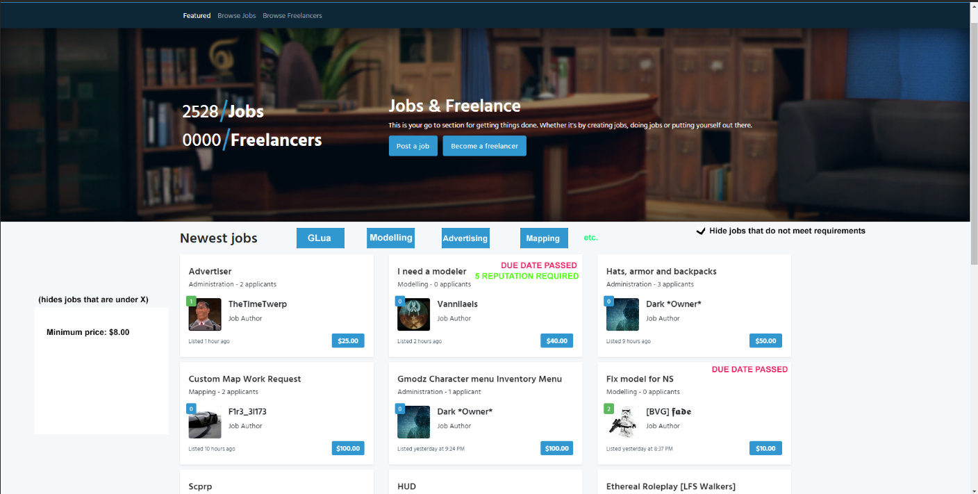
- "Due date passed" informs developers that the date has passed -- or you can just remove the job entirely from the section once it passes
- Buttons at the top to sort out categories for different specialties, or to organize things. (i.e. clicking Glua will only show Glua section, and not modelling, etc. You can select multiple sections, or click an "All" button to show all jobs)
- Enforce more strongly the 300 character limit. It's extremely annoying to see "Price negotiable, contact me for info on job" with no information on the job at all, what it's about, and etc. What's even more annoying is seeing "THIS MESSAGE IS TO BYPASS THE 300 CHARACTER LIMIT X20". Either remove the limit, or enforce the rule more strictly. IMO should just remove the limit. We don't need to read through unnecessary fluff to hit the limit like an English assignment.
- A "Contact me" section, where you can link your discord information, steam, etc. with a "copy to clipboard" button when clicking on it. (Make steam go to their profile, etc.)
- Make the reputation thing a bit less tedious to do. We need to confirm the budget understandably, but its way more tedious than what it use to be. Back then you did a job, confirmed it, and gave rep. Now you need to say you started, finished, confirm a budget, etc. There should be a "give reputation" button after all that. Now you need to go to their profile (like before) and give it to them after all that. There should really be a give rep button after. I've done a bit of jobs but its pretty tedious to do, even after the job is done.
- Reputation requirement on job making. Now personally, I think reputation requirements are retarded, but some people have them, so it's extremely annoying to go through a whole job description and see "YOU NEED AT LEAST 200 REPUTATION" even when the author doesn't even have one or two. It would be better to see if its posted on the front.
This is all I can think of off the top of my head. I'm sure there are more but these are the ones I believe would be a great QOL for everyone involved.