
ScriptFodder = gmodstore explained
The text on the main page is of the same color as the tree on the background, the first word is unreadable at all
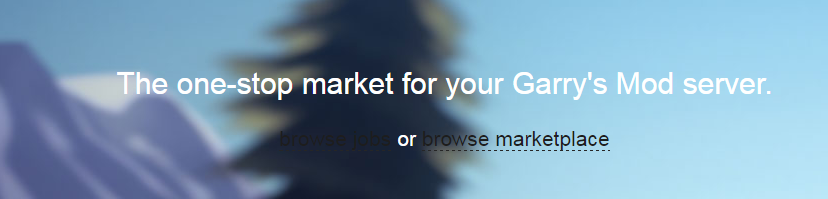
It has always been like that. It's only on smaller resolutions, I'm not sure if I want to fix it as the next big update doesn't even have the same main page look at all.
What was the "invalid session" all about few minutes before?
ByOmni | Vive Digitalsat 2nd of April 2017 17:26:41
What was the "invalid session" all about few minutes before?
Switched web server and redis - some code on how we do OpenID assumed the wrong validation URL. All fixed now.
Was that why I had to log back in? Or was that just me being stupid?
ByOwain Owjoat 2nd of April 2017 17:31:26
Was that why I had to log back in? Or was that just me being stupid?
I think so. I got logged out and when I was trying to log back in it prompted me "session invalid".
Just read what Matt said right above you, it literally explains why
Nice its better now
Just bought a script upgrade for 3599 and it doesn't show up.
It's quite splendid my good sir!
Can we get a lighter color for the dashboard and black subheader text colors for when they're not selected? It's a bit hard to make out at first glance against the dark backdrop imo

I haven't seen anyone ask about this yet but on mobile the contents inside of the drop down menus don't really stand out and they aren't seperated http://m.imgur.com/nMekkAh
ByPaperlacksat 2nd of April 2017 19:52:45
I haven't seen anyone ask about this yet but on mobile the contents inside of the drop down menus don't really stand out and they aren't seperated http://m.imgur.com/nMekkAh
There is not really anything wrong with that..... it looks fine.. the only thing I would do is put a divider between the profile name and the notifications (is that what you're talking about?).
So an example like this. Is this coming soon as a new feature? 
that's a picture of the update that is to come, yes. only it look a bit more like this now:

I've showed this picture before on Discord, so I guess I can show it again here. Also worth noting the script headers shown do not have the right size, you'll be able to upload new exact ones.
Oh that looks nice <3.
Ye, I agree with Blue, that looks sexy af
I like the new look (as in the screenshot posted, not the new css) but I really have a problem with the user icons being on top of the addon banners. I think it looks cluttered and takes up valuable space on the banner. Just a thought.
Aside from that it looks good.
(Also, the large and small banners have different aspect ratios. Does this mean we would have to upload 2 different banners or are they getting cropped automatically. If they are getting cropped, that seems annoying.)
When it's April 2nd and it still says GmodStore.
I love it though, looks awesome. It's a nice update.
ByBOT Dan ๐at 2nd of April 2017 22:55:46
I like the new look (as in the screenshot posted, not the new css) but I really have a problem with the user icons being on top of the addon banners. I think it looks cluttered and takes up valuable space on the banner. Just a thought.Aside from that it looks good.(Also, the large and small banners have different aspect ratios. Does this mean we would have to upload 2 different banners or are they getting cropped automatically. If they are getting cropped, that seems annoying.)
uploading 2 - big one is optional but obviously u won't get on big spot then