
SplashHud 5 second script.
So i tired to submit my SplashHud but i got the 5 second script but i want it to look simple and i don't know what to add/change
So if any of you got ideas please post them thanks :3
Here are some - hope this helps:
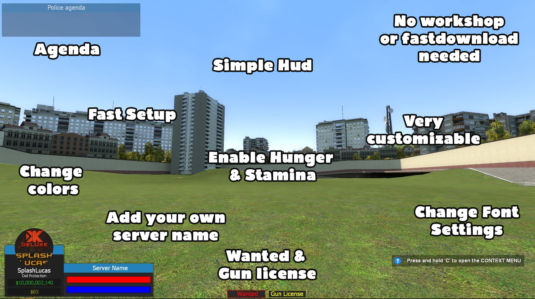
- Don't just use simple blur for panels. Give them something more. Allow server owners the ability to add images (grab images from URLs)
- Integrate the leveling systems that are available both on github and SF.
- Maybe an in-game config setup so owners can change aspects in-game instead of a config file?
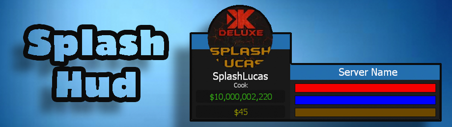
- Add values to your bars (all I see are colored bars but no indication of what they mean.)
- Bar animations (do they just instantly fill up, or do they animate from 0 -> current value?)
- Your circle looks a little choppy, try getting them a bit more smooth.
- Give owners settings to change almost EVERY aspect of color, maybe even positioning?
- Add an alternative feature to allow for an animated player model (DModelPanel) in case they don't want to use the player avatar.
- Add integration for pointshop/pointshop2 - so players can see how many points they have.
- Did you add a new styled ammo aspect?
- Maybe do something more than just the little boxes for wanted, etc. Add icons, maybe they blink every few seconds? (Little details matter).
Hope this helps.
Your outlines have spots where it doesnt reach all the way.
ByPatat 8th of July 2016 14:53:32
Your outlines have spots where it doesnt reach all the way.
Oh yeah didn't notice that
Edited
ByRichardat 8th of July 2016 14:51:17
Here are some - hope this helps:Don't just use simple blur for panels. Give them something more. Allow server owners the ability to add images (grab images from URLs)Integrate the leveling systems that are available both on github and SF.Maybe an in-game config setup so owners can change aspects in-game instead of a config file?Add values to your bars (all I see are colored bars but no indication of what they mean.)Bar animations (do they just instantly fill up, or do they animate from 0 -> current value?)Your circle looks a little choppy, try getting them a bit more smooth.Give owners settings to change almost EVERY aspect of color, maybe even positioning?Add an alternative feature to allow for an animated player model (DModelPanel) in case they don't want to use the player avatar.Add integration for pointshop/pointshop2 - so players can see how many points they have.Did you add a new styled ammo aspect?Maybe do something more than just the little boxes for wanted, etc. Add icons, maybe they blink every few seconds? (Little details matter).Hope this helps.
Thanks :3
You're welcome. Also, one more recommendation. Because I am a firm believer that your banner is the initial reaction point. That font with the really dark border, makes the text look choppy. And it's actually coming out in your work if you look at the hud. Use a simple text, smooth it out. And the drop-shadow is way too far from the original point of interest. You just want the drop-shadow to be a few pixels away from the text and image. Good-luck.
It's really good you're asking. It shows you want to improve. Good luck.