
Need help understanding decline reason.

It was denied because the visual appeal of it is just really outdated, and almost non-existent. This doesn't have anything to do with the code itself, but the style you came up with. There's so much more that could be added to make this look really good, and it seems like almost no effort was put into the UI. Just slapped a dark panel with some transparency, and called it a day.
Some of the panels (such as the top one), aren't even centered with your screen, the text is WAY too big for certain things. Just a very disappointing look.
Thanks for your reply :) That's a bit outdated, I have added sheets since then, also could you elaborate on such problems, also I would love for you to suggest some fixes. Thanks! Latest Version: 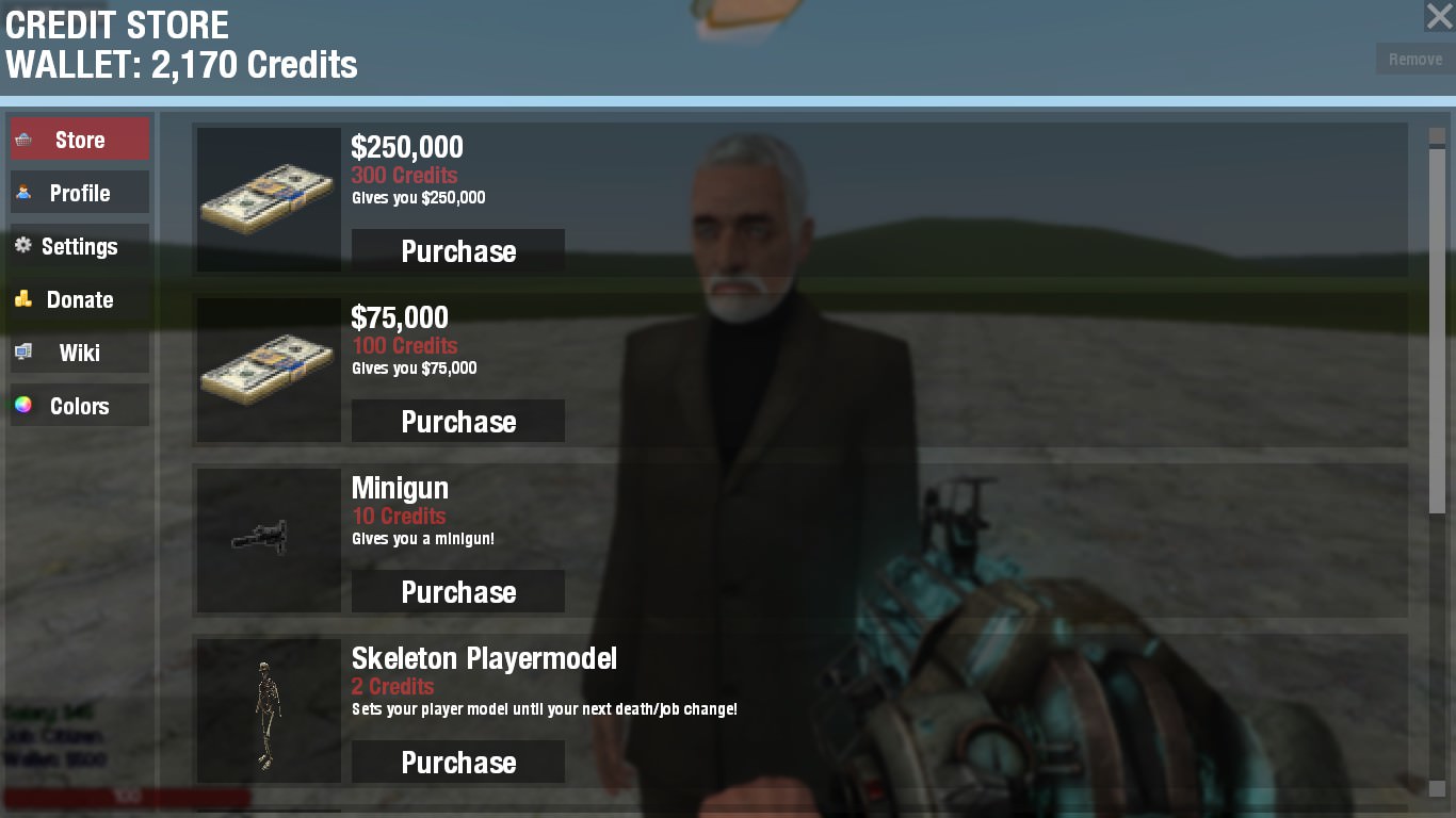
Also, the panels/frames are painted with a drawblur function.
ByRichardat 4th of November 2017 18:18:42
Tbh this is just another example of inconsistent acceptance, I don't really see much wrong with this script and it's a credit store it's not as if the only thing there is UI, that being said UI is of course a big part of a store of this kind and UI isn't done particularly well here but it looks functional.
Colour customization? That's further than other developers might go with their UI regardless of whether or not you see this as a trivial feature.
I'm not sure if dictating whether something is approved like this is even necessary seeing as the UI isn't horrific - customers will vote with their $$$'s in the end.
Thanks for that Nameless, makes sense what you said, but I have just been notified of some code problems after a resubmission. Anyway, if anyone happens to pass by, does this theme look better ( there is an option in the config to switch between the 2 themes). 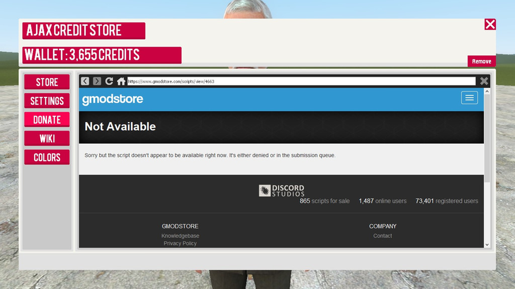
I don't think a script should be denied due to the style of the UI. Not all of us are artists. If it goes on sale people are not forced to buy it, if they don't like it they won't buy it. You're not hurting anybody by accepting the script.
Besides, this UI is amazing compared to some of the scripts that have been accepted.
Edited For a recent example, not that I have anything against owain but the two UI's look almost identical so what was the difference in one being accepted and the other not?

ByMomox | MomoxStudios.Netat 6th of November 2017 13:39:43
CodeBlue, totally with you, I actually had the same problem once, the official answer the mod team gave me was sth like:"The UI is the visual appearance of a script and we want it to look good to make the market look professional"Basically.
The market place is far from professional. This is a small community store, I don't see why such high standards are needed. Like I said, if they want it they buy it, if not then they don't. I mean, take a look at crap heads scripts. He is a mod and all his scripts use default derma skins and his banners are something from visual hell yet there is no problem with that? Is that because he is a mod, which would mean there is a bias which would steer even further away from professionalism.

TLDR: Mods should not deny a script based on visuals, if it works then it works let the customer decide.