Onyx Index | Responsive Index Page, now hoping for some suggestions!


Inspired by Richard's Gemerosity Collection, I am currently in the process of developing a responsive website for Garry's Mod community, and I would like to hear what this community thinks, or what you guys would like to see. I am always happy to listen to any sensible suggestions, so please don't hesitate to comment below.

- Responsive- Mobile, Tablet friendly.
- Style Customization- Change color values of your webpage via our back-end.
- Content Management System- Changes contents without you having any knowledge of coding.
- Steam-Integrated Staff List- fetching username and avatar of your staff.

- Source Servers Query (Free planned update)
- Pointshop2 Inventory List
- Darkrp/ TTT Richlist
- Multiple Reskins
These will either be released as free updates/ DLC at small cost

$7.00, 10% off for first 24 hours

Feel free to add me on steam, or via email: [email protected]

Richard's Gemerosity design influence, which I am granted permission to include similar style in this web script.
Edited
Dev Diary 1
STEAM openid sign in, user data and ip logging - 100% Content Management System - 50% Theme Customization - 10%
Bootstrap v4 (for the sake of responsiveness)
Preview (Not the final product): 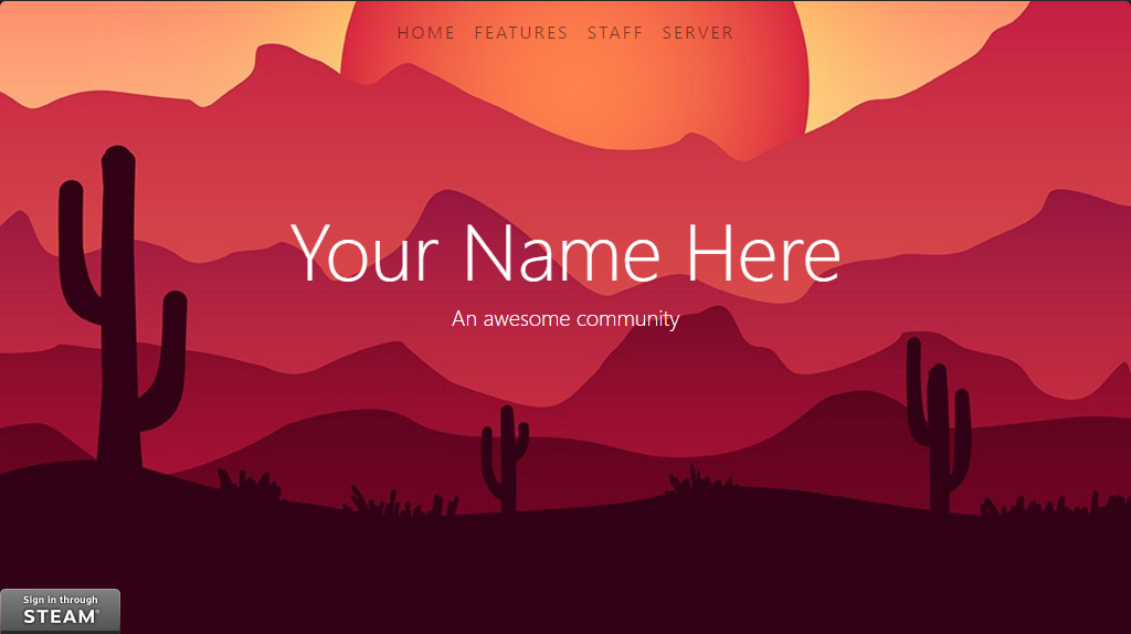
Bykanalumaddelaat 21st of April 2017 16:40:26
By the looks of it, it's just fixed at the bottom left without any spacing away front the bottom and side edges. Also it's gonna look out of place all the time since the steam login button looks retarded, but all sites have to use it.
I am going to photoshop and put together a flat steam sign in button to fit the overall scheme.
ByØwain Øwjoat 21st of April 2017 14:54:02
I feel like the "Sign in through STEAM" button is very out of place....
I am aware of that, and this is being redone as the first screenshot is pretty much within 10 minutes of pure front-end coding and haven't got to that part yet.
Anyway thank you guys for commenting, I will be pushing another screenshot in a minute or so.
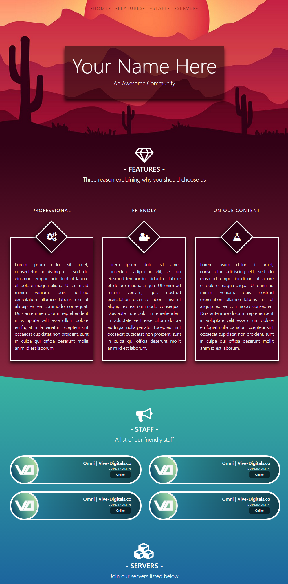
Edited Here is pretty much what the page will look like except server list and footer which is wip.
ByOmni | Vive-Digitals.coat 21st of April 2017 17:20:35
I am going to photoshop and put together a flat steam sign in button to fit the overall scheme.I am aware of that, and this is being redone as the first screenshot is pretty much within 10 minutes of pure front-end coding and haven't got to that part yet.Anyway thank you guys for commenting, I will be pushing another screenshot in a minute or so.EditedHere is pretty much what the page will look like except server list and footer which is wip.
Much better to what it was previously, I would say the navbar needs to be a bit more brighter as that text is a bit dark (on my phone so might be why)
Not to throw the conversation off too far, but I must say that the banner is very nice. Did you make it? Or?
ByØwain Øwjoat 22nd of April 2017 22:46:01
Not to throw the conversation off too far, but I must say that the banner is very nice. Did you make it? Or?
I did make the banner myself, and the geometric background used in the banner is obtained under cc0 license.
Re lubricantjam,
Yes I do agree with you that the nav bar should be a little bit more obvious, so probably it can be done by using differnt font weight,possibly with a text glow/ shadow, but definitely a change in text colour.
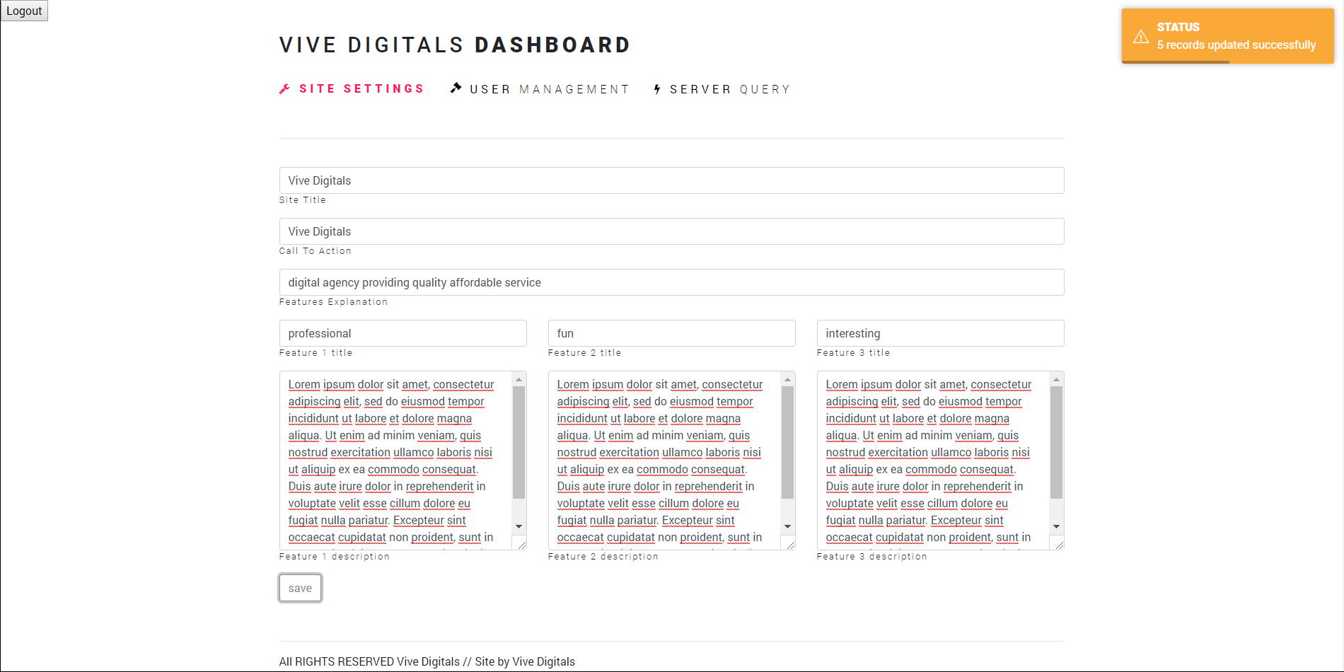
Edited Very old thread, was meant to be posting development updates but life got busy and this got put aside. However I have just been finishing off some simple CMS backend which is attached in the following screenshots.
Please do comment and give me any opinion because I am eager to accommodate majority of people without compensating the performance and user experience.
**P.S. The logout button is out of place I know, things are not finalised so I am happy to change anything suggested which is deemed sensible. **